Visualising Denmark’s Cultural Heritage
The proverb “a picture is worth a thousand words” means that still images embody the power to express complicated concepts, ideas or relationships much more effectively than textual descriptions.
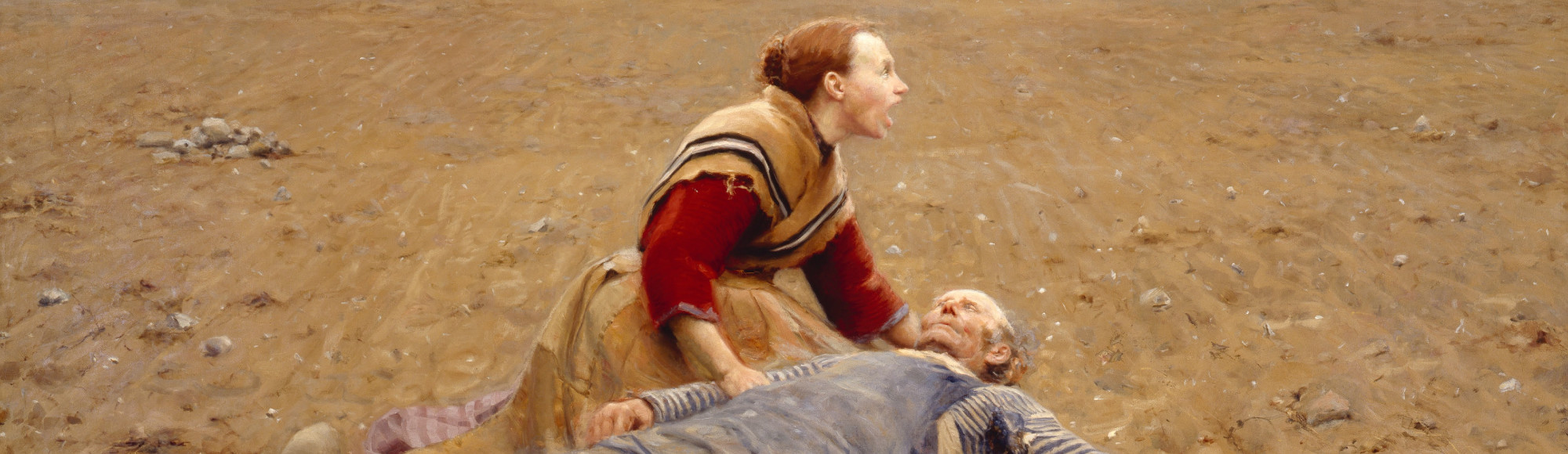
The painting Udslidt by social realistic painter Hans Andersen Brendekilde can be seen as an artistic implementation of this proverb. It reflects the hard rural life in late 19th century Denmark, specifically emphasised by the man who died from hard graft, his screaming wife, and the wasteland that frames the scene. Even though the latter sentence provides a detailed description of the problem, the painting does a much better job in conveying the socio-critical message to the observer.
Visualisation as a method to analyse data displayed on the screen makes use of the human ability to quickly perceive patterns inherent in the data. A visual design process translates a real world concept (e.g. Danish art) into visual representations in order to make the concept easier accessible to the observer. In this context, real world objects (e.g. Danish painters) related to that concept are transformed to data entities (e.g., persons) described by specific attributes (e.g. life data, number of paintings, painting style) and relations among them (e.g. familial, collegial or teacher-student relationships between painters). These attributes and relations are then translated to a visual vocabulary (e.g. a time chart depicting the life data of painters or a social network graph to illustrate relations) capable of reflecting occurring patterns.
The visual design process always involves a distortion, thus, needs to be undertaken with care in order to ensure that the observer is able to draw accurate conclusions. However, especially in application scenarios involving non-experts in computer science, visualisations are indispensable means for hypothesis verification and generation concerning domain-specific data sets.
In the past ten years, I have been working together with experts from various domains, among which most of my projects were interdisciplinary collaborations with humanities scholars in the context of the digital humanities. As a consequence of the digitisation endeavours in the past decades, humanities scholars now have on-demand access to large amounts of cultural heritage data, and the digital humanities as a research domain addresses the need of developing solutions to make sense thereof.
Visual data exploration has been proven a valuable research instrument in this context and continues on gaining more and more importance for knowledge discovery. The remainder of this article sheds a light on how visualisation can reveal different aspects of Denmark’s cultural heritage.
Visual exploration of the Dansk Biografisk Leksikon
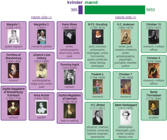
In her article on cultural heritage, humanities scholar Elena Franchi emphasizes that all people contribute to the culture of the world. The more important a person for the culture heritage is, the more is written about that person and related artifacts. The most influential persons for Denmark’s cultural heritage are likely to be found in the Dansk Biografisk Leksikon (DBL). Its third and last edition published between 1979 and 1984 offers biographical information for around 20,000 persons, both Danes and foreigners who significantly contributed to Danish social life and culture. For around 6,000 persons, an entry exists in the Danish Wikipedia, which can be seen as a digital DBL edition (dDBL) containing the persons of most contemporary relevance. A variety of structured biographical information is available, amongst which gender, lifetime, place of birth and professions are provided for a large number of persons. The diversity of these attributes provides a suitable basis for a visual exploration scenario, in which we focus on the comparison of women and men in the dDBL.
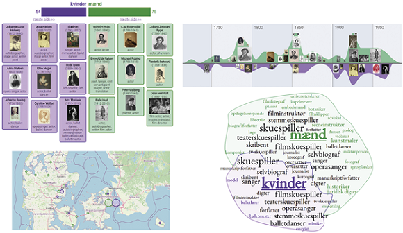
The gender ratio is depicted in a bar chart view in Figure 2. This first, very basic form of visual data representation reveals the strong gender imbalance in the DBL accurately, as the displayed ratio corresponds to the ratio of the third printed edition that contains around 7-8% women. The bar chart is coupled with a list view that orders all women and men according to their suggested impact on the Danish cultural heritage. This impact is approximated based on the Wikipedia entry of a person: the more text is written about a person, the higher its impact. Clicking an entry redirects to the corresponding Wikipedia entry.
In order to support information seeking, three interactive visual interfaces have been designed, all of which support a comparative gender analysis of biographical features.
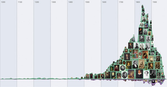
A timeline separates women and men in two streams. Persons are grouped into decades using the mean lifetime year (or the date of birth plus twenty years in case of living persons or the date of death in case the date of birth is not known). Thumbnail images placed on the streams inform on the most impactful persons for specific time periods. Figure 3 illustrates the entirety of lifetime data in the dDBL. Whereas the large number of men in the 19th century pictures the Danish Golden Age, a period of exceptional creative production, women seemingly received major attention when the first edition of the DBL was published between 1887 and 1905.
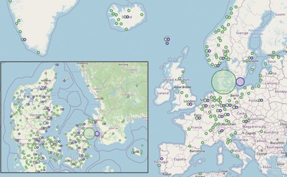
A map uses non-overlapping circles to contrast the places of birth. It has to be said that this information is only provided for around half of the persons. However, a geospatial exploration supports questions like “What persons of historical importance were born in my city?” The size of a circle reflects the amount of persons born in a specific region. Though most persons in the dDBL were born in Denmark as shown in Figure 4, the widespread distribution of dots yet documents an international impact on Denmark’s cultural heritage.
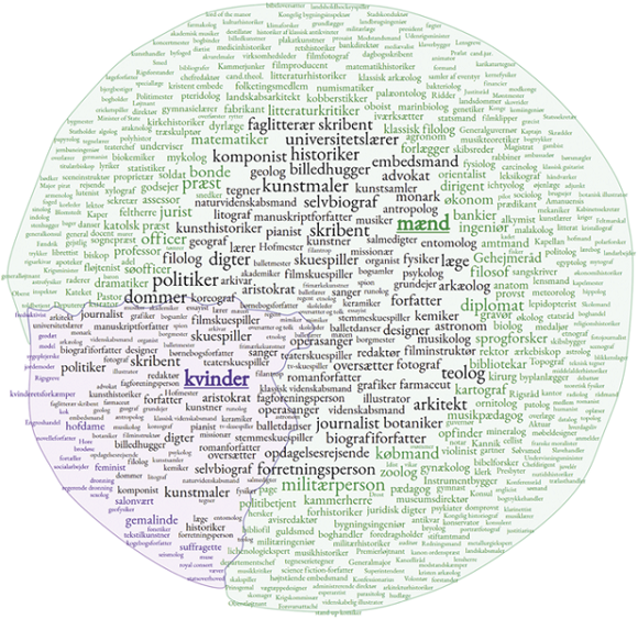
A tag cloud visualisation illustrates the differences and commonalities among the professions of women and men in the dDBL. While tags coloured in purple or green represent professions that were only practiced by women or men, black-coloured tags stand for professions practiced by both groups. Font sizes reflect how often a profession has been practiced. Black tags are further positioned according to their balance between the two groups. If the same number of women and men practiced a profession, tags are positioned closely to the center of the cloud, whereas tags move to the outer bounds when the ratio is imbalanced. At least one profession is provided for 5,127 persons, and a summary of all practiced professions is given in Figure 5.
Each visual interface provides an overview of the distribution of values for the corresponding attribute using the same colour scheme, and charges the visual attribute of size to reflect quantities. All interfaces are linked with each other and means of selecting specific attributes via mouse interaction enable a multifaceted visual exploration of the data set.
All views are updated only including persons matching the query that can be composed of selections concerning multiple attributes, thereby supporting manifold research inquiries. For example, selecting a time range from 1700 to 2000 in the timeline and professions related to acting in the tag cloud leaves 129 persons with a far more balanced gender ratio. The result is depicted in Figure 6. The map further indicates that acting is a rather urban profession as related persons were typically born in large cities.
This case study on the dDBL exemplifies how visualisations generate humanly perceivable patterns that can guide the user in a visual exploration process. In addition, visualisations are capable of emphasising important data entities, which are, in the case of the dDBL, persons who significantly contributed to Denmark’s cultural heritage.
A distant reading of Hans Christian Andersen’s and Søren Kierkegaard’s writings
Two among the most impactful male persons in the dDBL are Hans Christian Andersen and Søren Kierkegaard, both of whom are recognised as the most important Danish writers of the Danish Golden Age. While Andersen is primarily known for his fairy tales, Kierkegaard is perceived as the first existentialist philosopher through his writings. Both shared an ambivalent relationship reaching from contempt to respect, and they also referred to each other in their works. We perform a distant reading approach to investigate if this ambivalence is reflected in their writings.

Distant reading, a term defined by the digital humanist Franco Moretti, describes quantitative approaches to text analysis. Instead of reading texts, in analogy to Information Seeking, texts are regarded from an overview perspective, in which typically frequencies of words are compared.
Figure 7 provides such a quantitative view on a fragmented, but representative text corpus including 89 stories (240,734 words) of Andersen (blue) and 12 writings (90,770 words) of Kierkegaard (green). The frequencies of words from both authors are counted, normalised in relation to the numbers of words, stopwords are removed and the 250 most frequently used words from both authors are comparatively visualised. Stopwords are most common words in a language, e.g. short function words like articles or prepositions. They appear frequently in all texts and contribute less to the meaning of it. Without filtering them out, the 250 most frequent words would be mostly stopwords.
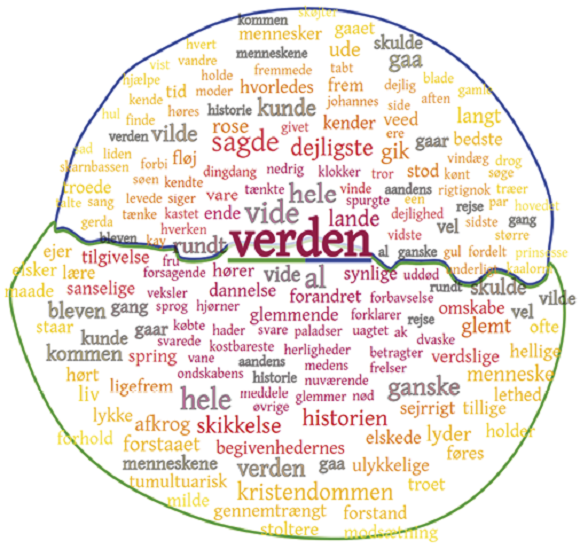
On first sight, the two thematic fields are well-reflected by the blue and green sectors of the tag cloud. While blue-coloured words like “prinsessen”, “slot/tet” or “kejseren” explicitly refer to Andersen’s fairytales, other words denoting plants, animals or colours accurately picture the scenes in which the stories are told. On the other hand, Kierkegaard’s focus on religion is depicted by frequently used words like “gud”, “biskop” or “kristendommen”. The shared part in the centre of the cloud mostly contains adjectives and function words. However, both writers paint their personal picture of the world as both frequently use the word “verden”.
Figure 8 analyses the context, in which the word appears in more detail using a different visual mapping, adapted from a distance-oriented tag cloud visualisation. The blue-bordered sector refers to how Andersen used "verden", the green-bordered sector to how Kierkegaard used it. The colour of a word informs on the average distance of words that frequently co-occur with "verden". Red-coloured words are typically descriptive and appear very close to "verden" in the text, e.g., as left or right neighbours. Yellow words typically define the broader context of "verden" as they appear in larger word distances. The figure illustrates that Andersen’s world is framed with rather positively-associated words like “dejligste” (nicest) or “bedste” (best), Kierkegaard’s picture is more contrasted as also negative words like “uddød” (extinct) or “hader” (hate) appear.
What is further evident in both Figures 7 and 8 is that Andersen’s characters rather think (many variants of “tænke”) and ask (“spurgte”), while Kierkegaard’s characters seem to understand (many variants of “forstå”). In summary, Andersen draws an imaginative, deliberately naive picture of the world posing questions on how it functions, whereas Kierkegaard delivers contemporary, realistic answers. Thus, one can conclude that both writers have been mutually reviving, complementary personalities of their time.
A distant viewing of Hans Andersen Brendekilde’s paintings
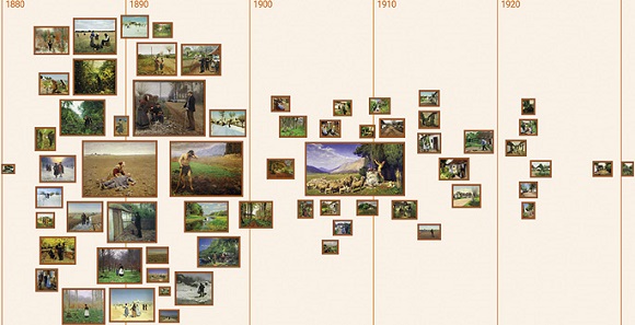
In accordance with the concept of distant reading, distant viewing refers to a quantitative analysis of visual material. By mapping images in a meaningful way, can we detect patterns and are we able to draw conclusions? As Figure 3 suggests that this is indeed possible, we apply the respective visualisation method similarly to the oeuvre of Hans Andersen Brendekilde. Figure 9 arranges 64 of his paintings on a timeline according to the date when Brendekilde painted them. Image sizes in the visualisation correlate to the real painting sizes, which makes the height of the timeline reflect the amount of painted area at a certain time range.
The visualisation instantly makes two creative periods discernible. The first one from around 1880 to 1900 places the above mentioned socio-critical painting “Udslidt” in its centre. It is surrounded by other paintings like “En Landevej” or “Fortrykt” addressing related problems of the rural population at that time. Some paintings illustrate scenes in a Mediterranean setting, capturing Brendekilde’s visits to Italy, Egypt, Palestine and Syria.
In the second period from around 1900 to 1930, the religious painting “Abel’s offer” (1908) stands out. However, this period is rather characterised by small paintings depicting scenes of an idyllic country life, which is in contrast to the socially critical themes of his first period.
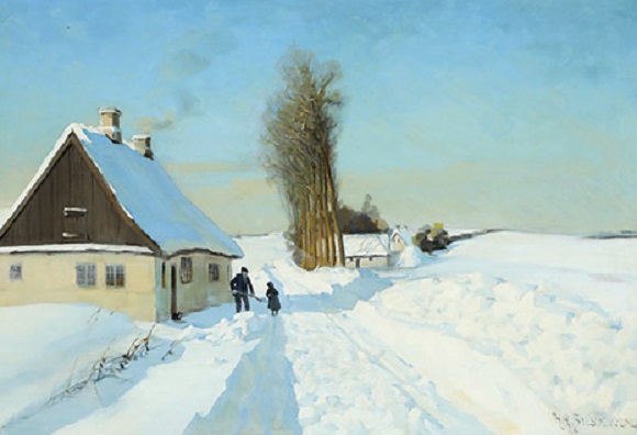
The collection also contains undated paintings, such as the one shown in Figure 10. The pictured scene leaves room for interpretations. Either it shows an idyllic family scene in the winter with an old man shovelling snow, an accompanying grandchild and a cat leading the way to the warm inside of the house, or the painting illustrates how isolated life in the countryside was.
As the painting has a rather large size, the latter interpretation that situates the painting in Brendekilde’s first creative period appears more likely, because, in the second creative period, he rarely pictured idyllic country life on large canvases.
Summary
Though some of the patterns revealed by the visualisations are expectable, especially for domain experts, it is well documented in the literature that such new perspectives are also capable of generating new hypotheses on well-studied material. A further benefit of the intuitive, playful visual exposure of information is the potential to engage casual users to interact with data of societal relevance.
The above listed scenarios document that one and the same visualisation technique is capable of supporting diverse research inquiries. This generalisability is invaluable as it inheres the potential to build bridges between computer science and many other areas. Without visualisations, quite often, algorithmic methods would be inaccessible, results would be incomprehensible and data-inherent patterns would remain hidden.
Meet the researcher
Stefan Jänicke is an assistant professor at the Department of Mathematics and Computer Science. He is engaged in developing information visualisation and visual analytical techniques within a wide range of interdisciplinary research projects.