Hi Nathalie, can you give our readers a quick introduction to yourself and an overview about your academic work?
My name is Nathalie Schümchen, I was born and raised in Germany but have beeen living in Denmark since 2010. I did both my Bachelor’s and my Master’s at SDU Sønderborg and am currently working on my PhD degree at the Department of Design & Communication at SDU Sønderborg. I’m part of a project called Improving L2 Pedagogy at the Prosodic-Pragmatic Interface Using Human-Robot Interaction.
What is the topic of your thesis?
In my thesis, I work with the design and evaluation of visual teaching materials for second language learning (Danish, English, and German). In other words, I’m on the one hand designing teaching material and on the other hand testing and evaluating the materials regarding their user-friendliness.
This means that I among other things run usability tests in which I invite learners to use the material and comment on it.
How would you analyze a usability test?
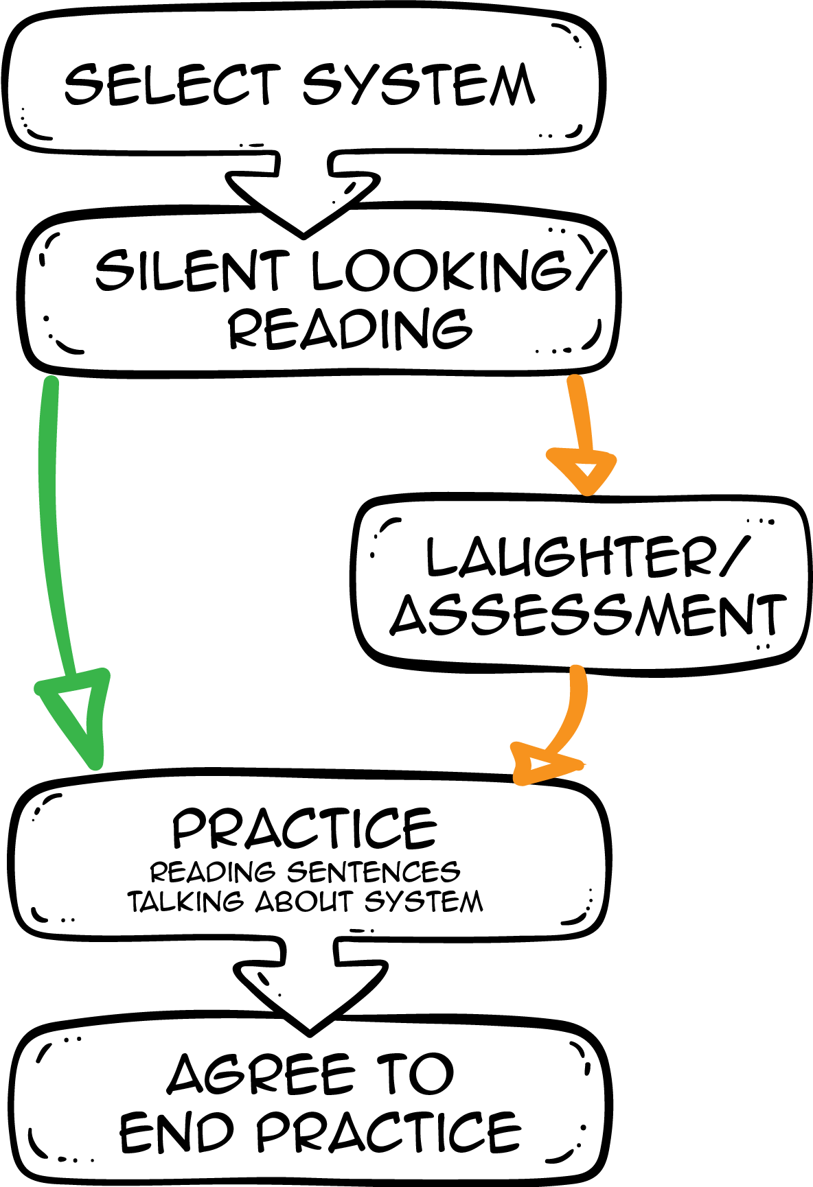
I invite participants - sometimes groups, sometimes individuals - to work with some of the designed materials. Some participants look at the material kind of “from the outside” in that they comment on the material, other participants get to work more closely with the material and I observe what they do. In order to observe and analyze these usability tests, I videotape them and use several methods to analyze these recordings later. One of these methods that I use for analyzing how materials are perceived and used is conversation analysis.
Conversation analysis is a data-driven method for the analysis of interaction. I think it is useful for my purposes because I can look at my data without forming any hypotheses beforehand and let the data lead the way and determine my analysis focus.
Common visualization techniques
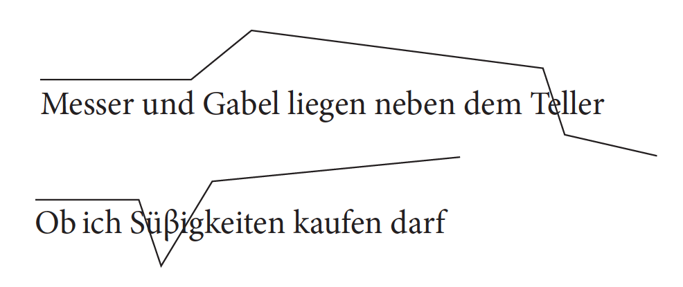
The stylized “hat pattern” visualization technique, drawn according to the reference productions.
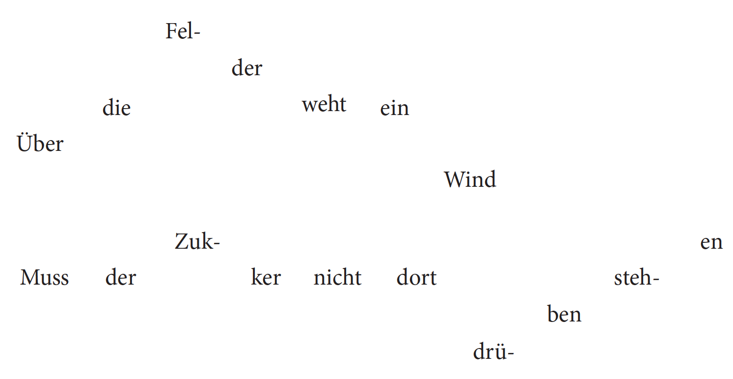 The “meandering text” visualization technique, designed according to the reference productions.
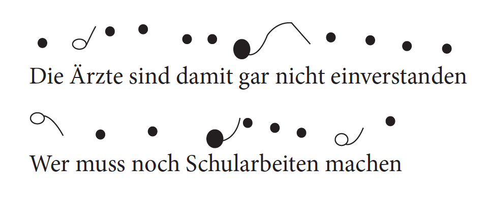
The “tadpole” visualization technique, drawn according to the reference productions.
All screenshots and captions from "Comparing visualization techniques for learning second language prosody" by Oliver Niebuhr, Maria Alm, Nathalie Schümchen and Kerstin Fischer, 2017.
What does that mean for your experiments if data leads the way?
It means that I don’t work with very specific hypotheses when I analyze the data. I might have some ideas what to pay attention to, but that doesn’t always mean that this is what I eventually end up analyzing. This means that I can act upon what strikes me as interesting - and look more closely into what struck me as interesting.
Can you give me an example for that?
For one study, we were working with intonation, or speech melody. For that study, we collected data in which groups of two participants at a time were asked to look at teaching material about German intonation, discuss it and try to follow the given instructions of how to pronounce different sentences.
For the analysis, one colleague focused on the way the participants read the example sentences aloud and compared the participants’ performance with the correct pronunciation of the sentences. This is called phonetic analysis. After that analysis, it was my job to I looked look at what the participants did during their discussions, and how they agreed on how a sentence should be pronounced.
What were the results of the phonetic analysis?
The results of the phonetic analysis showed us that some visualizations of intonation worked better than others. In particular, the results showed us that iconic visualizations, so visualizations that use things like ‘up’ and ‘down’ for intonation, seemed to work better than symbolic visualizations, or visualizations that use more or less arbitrary symbols to represent intonation.
Is there any likely explanation why iconic visualization worked better for the participants than symbolic visualisation?
We had the same question, so we looked at the data in more detail to see how the participants actually figured out how the different visualizations worked. One of the things we noticed was the way the participants used gestures during their discussions of the materials.
These gestures resembled very much iconic visualizations. The participants were actively re-enacting iconic visualizations through their gestures. This might explain why this kind of visualization worked especially well for the participants.
What other reactions did participants show?
While they typically went right into practicing a sentence with iconic visualizations, the participants would often laugh or show some other emotional reaction to the symbolic visualizations. Our interpretation of this was, that participants perceive symbolic visualizations as more difficult to understand and as less intuitive.
Schematic visualization of phases. (Drawing by Maria Vanessa aus der Wieschen)
Can you tell me a bit more about what types of material you are developing and how you test them?
In collaboration with experienced teachers, I identified some topics in language learning that have always been tricky to teach, both in oral and written communication.
Oral communication topics that we have looked at in our research group are for example German intonation (speech melody), and vowel quality. But I also investigate more unconventional topics such as the effective use of hesitation markers on presentations. Hesitation markers are sounds like ‘uh’, ‘uhm’, and ‘mh’.
As for written communication, I’m currently running usability tests on material about English grammar, adjectives and adverbs in particular.
Why would somebody deliberately use hesitation markers in a presentation? Aren’t hesitation markers just a sign for poor preparation?
Not necessarily! Most of us have probably listened to a presentation of which we don’t remember the content but how often the speaker said ‘uhh’ or ‘uhm’. These hesitation markers are often relatively loud, long, and occur in ‘unnatural’ positions, and this is why we notice them. Saying ‘uh’ and ‘uhm’ isn’t bad per se. Hesitation markers make us sound more natural and personal. Using a hesitation marker before changing the topic or in front of important words or phrases can actually help people to remember important information better.
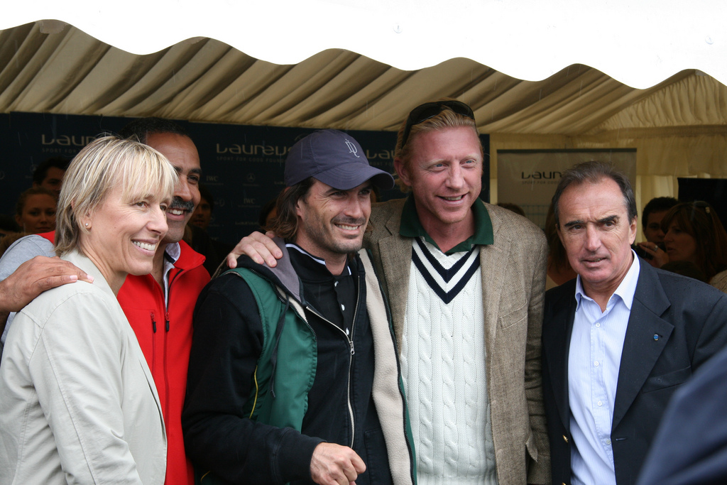
Former tennis player Boris Becker (second from right) is known for the excessive use of hesitation markers like "Äh" or „Ä-ä-äh“ in spoken language. (Image by Billpolo, CC BY-SA 3.0)
A lot of your work is based on visualizations. What do you have to consider when working with visualizations?
In my project, I’m interested in figuring out which kinds of visualizations work in which context. For example, which kind of visualization helps people to understand the difference between adjectives and adverbs and where adverbs should be in a sentence? Do you really need visualization for this task or is a well-structured text already a sufficient teaching resource? Does it help to underline and highlight different aspects in different colors? Can a metaphor help to grasp the concepts?
How would you test your materials?
In order to test the materials, we’ve used different set-ups, sometimes letting two participants work something out together, sometimes having just one participant and an experimenter discussing the materials. What they all have in common is that we invite potential users and let them work with the materials and comment on them while they do that.
How are these sessions recorded?
I videotape them. Then I can analyze the tapes and look at how the participants in the studies interact with each other as well as the material. I can for example see what people pay attention to, what’s easy for them to understand, and which parts are more tricky or even near-impossible for them to understand. In this way, I can see which parts of the material work well and which parts need revision.

A test result of an experiment with different visualization techniques. It is summed across the tested subjects and all three error types (sums can therefore be higher than 100%).
How important is visualization for you in general and for your academic work in particular?
I think that visuals can in many cases help us to understand, remember, and apply everything from simple facts to complex relations and abstract concepts. The focus on visuals in my own project comes not least from my personal interest in creative, especially visual techniques. I love to draw! And when I realized that visualizations are a powerful tool to convey complex information, it just made sense to make it a focus of my project.
That said, it does take time and creative energy to make a good visualization, but visualizations are - especially combined with text - a very effective resource for any context in which information is conveyed.
To round it up: How would you describe the practical use of your studies? And who is benefitting from that kind of research?
The results from the different analyses help us to understand how people use different materials which thus helps us to design better materials.
Thank you very much for the roundup and the interview! All the best with your thesis and thank you very much for the interview.
Thank you.